The project that’s top of my list right now? Paint!
Maybe you have the same feelings about paint as I do – a true love-hate relationship. I walk into our local paint store and get excited with those little paint chips. They all speak to me and grab about 20 thinking “wow, all of these are perfect!”. Then reality sinks in once I’m home … quickly getting frazzled because of those “little” paint chips. It’s barely enough color to give an accurate look at the undertones. And I don’t like making a decision on a color when I’m basing it off a 1″ x 1″ chip.
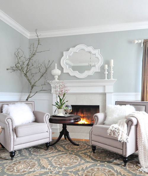
Since I’m trying to move away from the darker colors in our previous house (it made the house feel so dark…see a good example here), I’m leaning into a light, bright but warm, beachy feel for the new house. It’s my way of saying “welcome back to Cali”….Even though the beaches in nor cal are cold, windy and foggy. Anyway, I’m looking at light grays, whites and shades of greige. But they all have undertones you may not like so you need to be careful before painting an entire room. Or in my case, having the painter paint the entire home interior when I live 2,500 miles away.
Fun times.
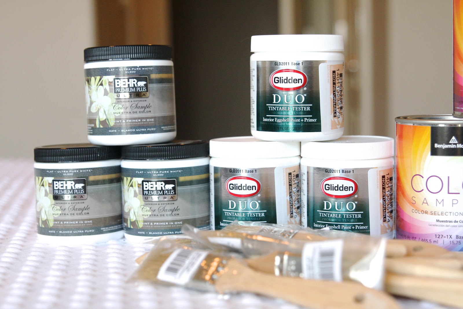
To make this process a bit more stress-free, I narrowed down my stack of 20 paint colors to 11 and paid a small fee to have samples made…

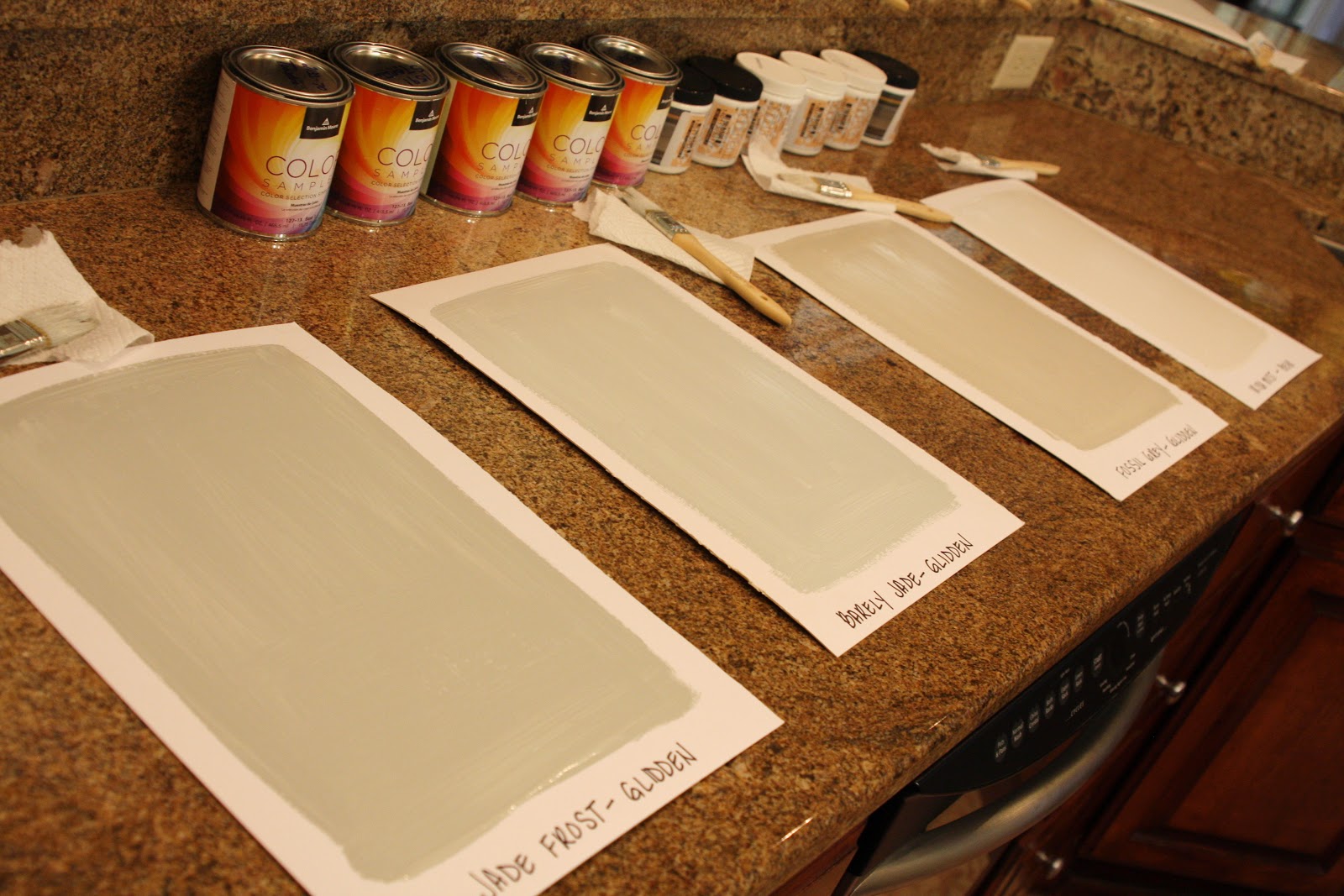
5 colors are from our local Benjamin Moore store and the rest are Behr or Glidden colors. About $5 per can..And about $3.50 per jar…
As far as where to paint these samples, I’m sure the owner of our rental house wouldn’t appreciate a wall full of paint samples. Ha! Instead, I grabbed these great flat canvas boards…
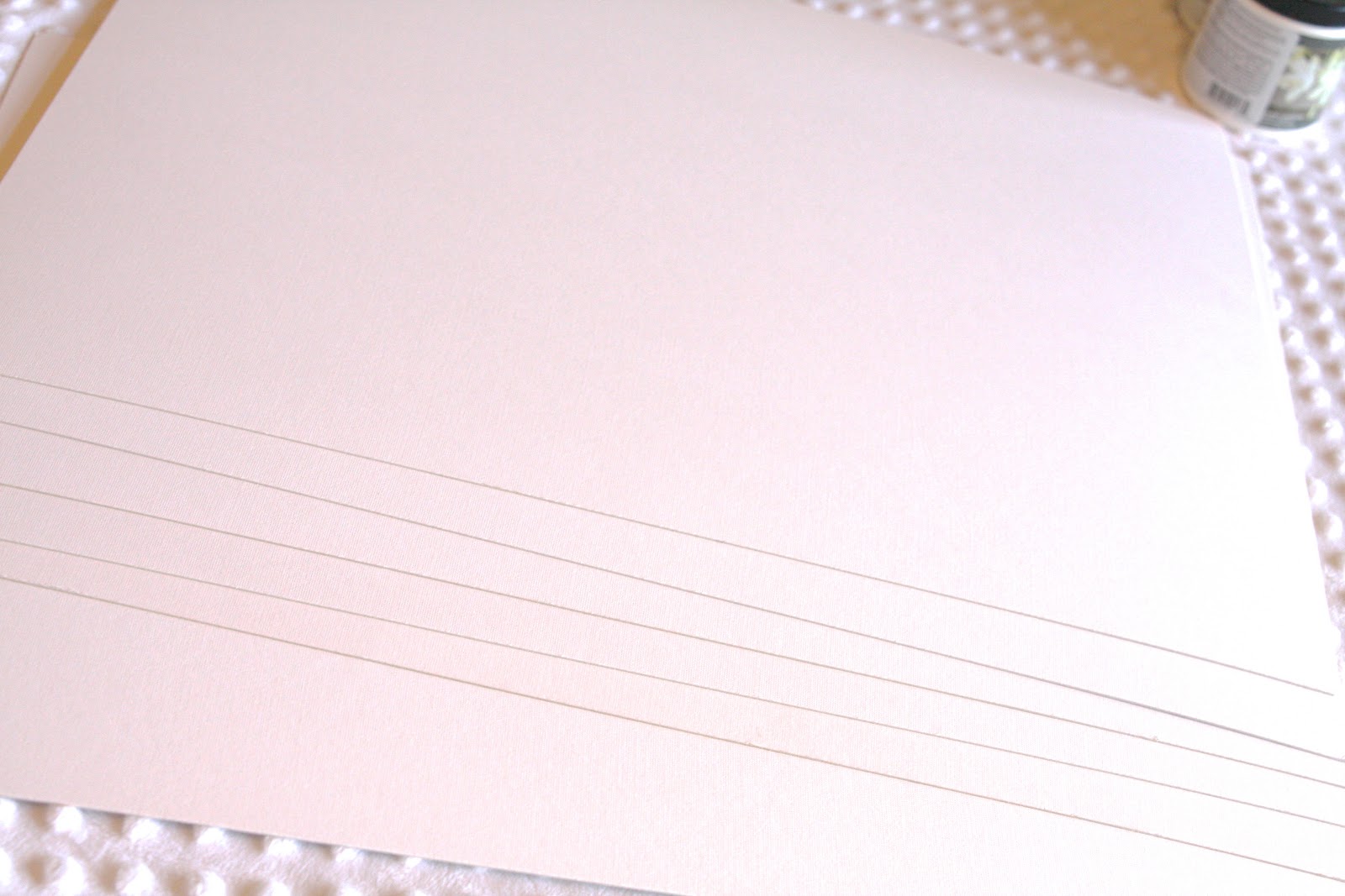

No, it’s not a wall, but this did the trick!
I purchased 6 boards and cut them in half…
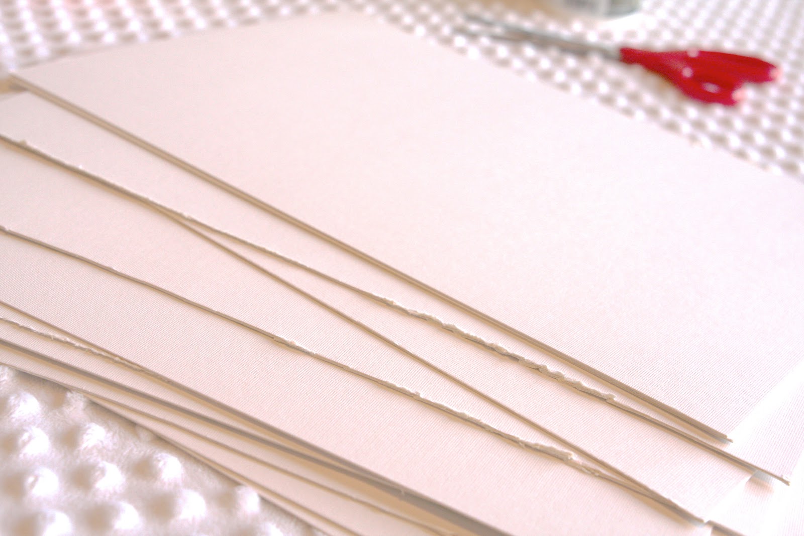
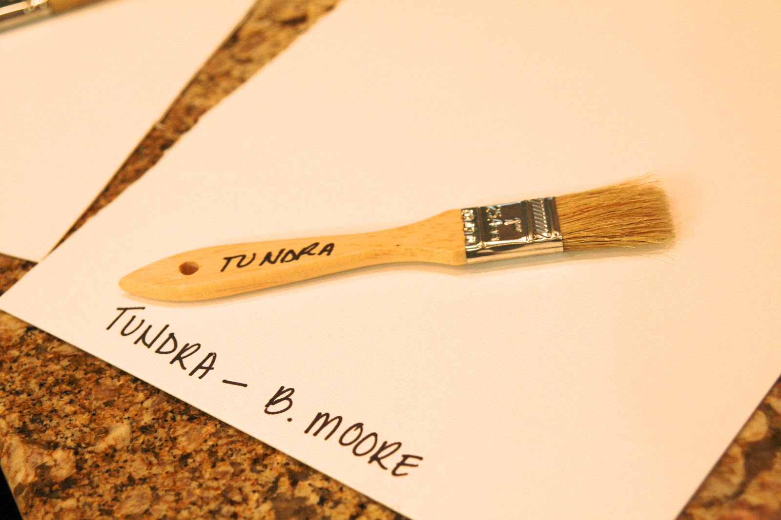
Then I wrote each of the paint names/brands at the bottom of the board…

As well as each paint brush…
Since I was applying 2 coats of paint (read = because i’m a total distracted airhead), I didn’t want to chance mixing up the paint on the boards. Go ahead, call me obsessive crazy.
Finally the fun part – painting…
I spread out everything on the kitchen counter and painted in between making breakfast for the kiddos…


When they were dry a short time later, I now had big paint samples. Samples that really helped me pick up the undertones. Another positive – these samples can fly to California with me in a few weeks to make final decisions with the painter.
Some of the paint colors I chose were found online – pinterest or houzz. Can’t express enough how different these colors were in person – on the paint chip and sample boards. We can’t trust the paint colors we see online – you have no idea how the photo has been edited (lightened or darkened).

Just talking out loud here – of course, tomorrow I could totally change my mind and paint the entire house in tranquility. Basically, consider this post a conversation with me, myself and I. Because although I have picked these 11 colors and love them all, next week I may be painting another 11 (or more) samples. I’m finding as much inspiration as I am changing my mind. I told you, paint and I have a love-hate relationship!
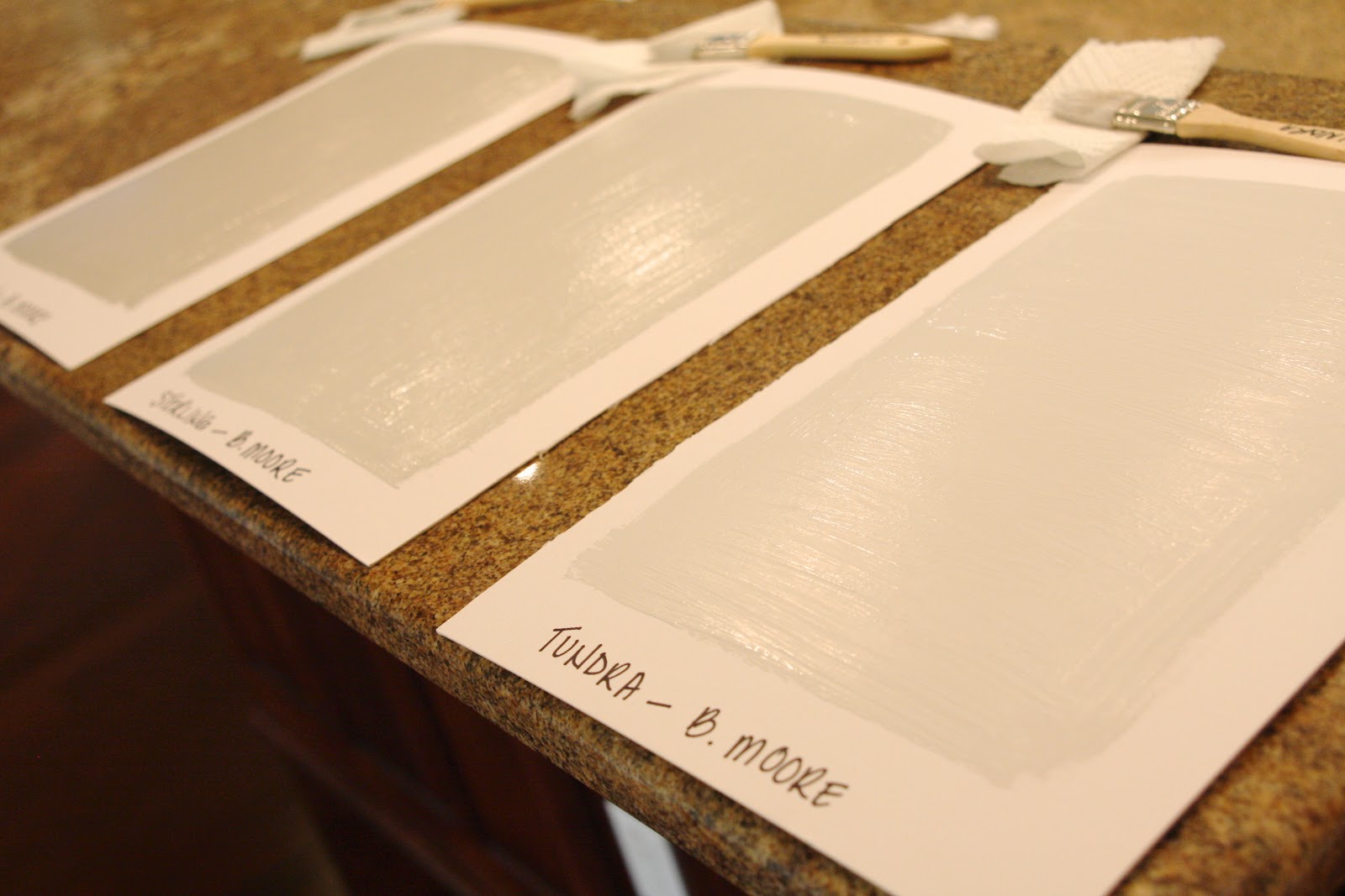
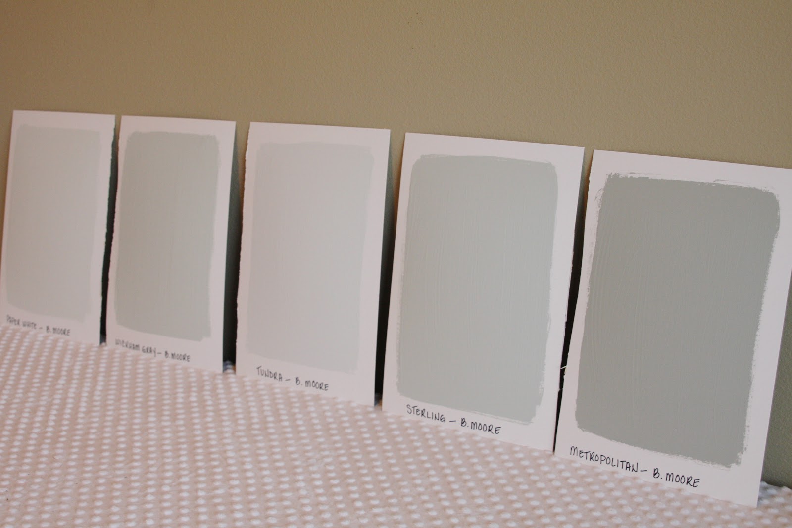
Without further ado, here are the 11 colors I (currently) love. From Benjamin Moore….
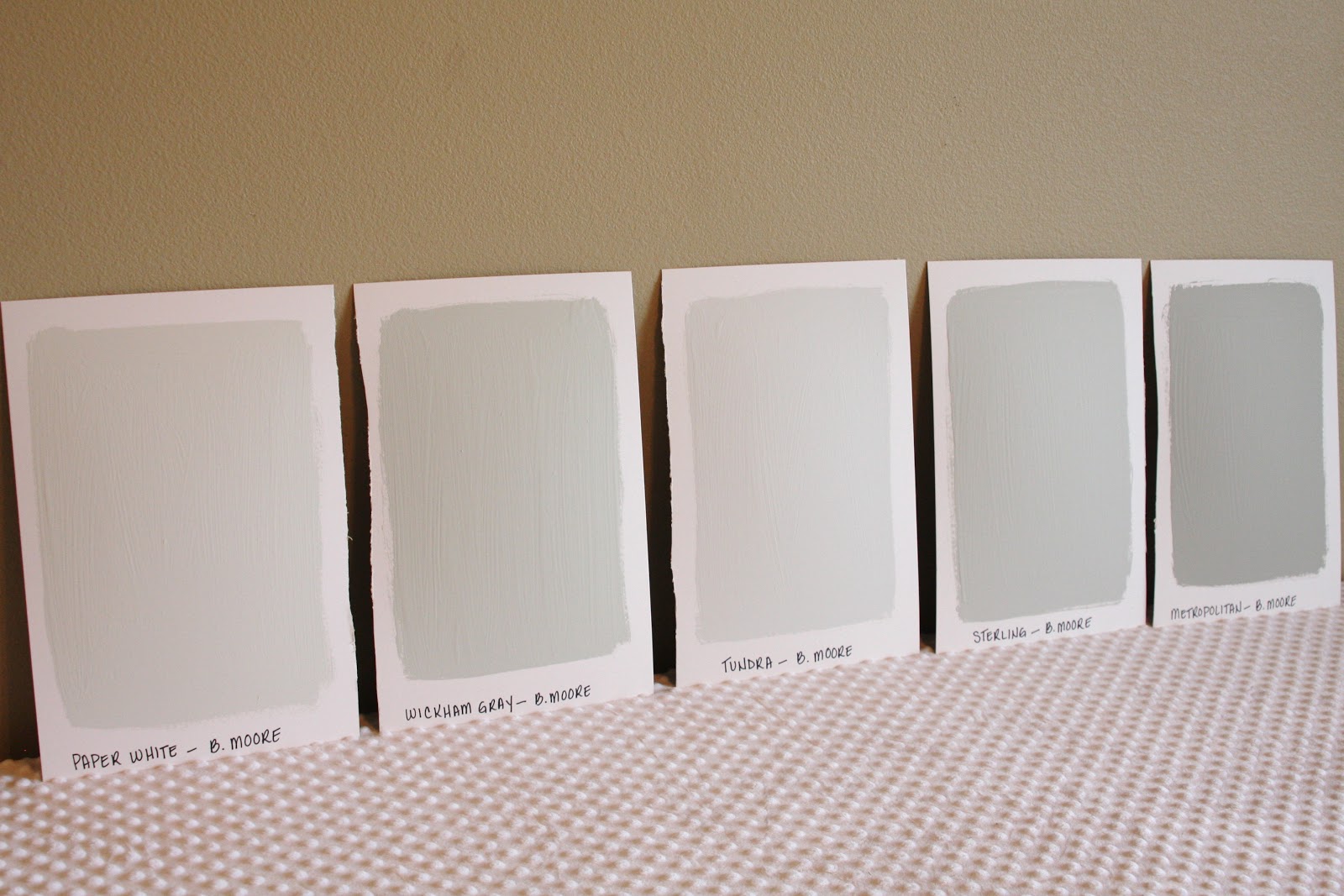
* Paper white, wickham gray, tundra, sterling and metropolitan
I tried not to edit these images very much so that you can see the “true” color.
From Glidden…
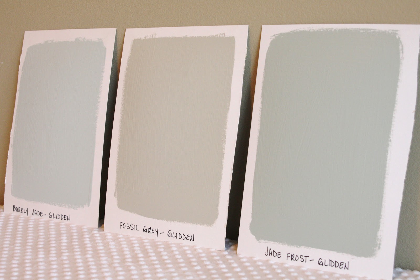
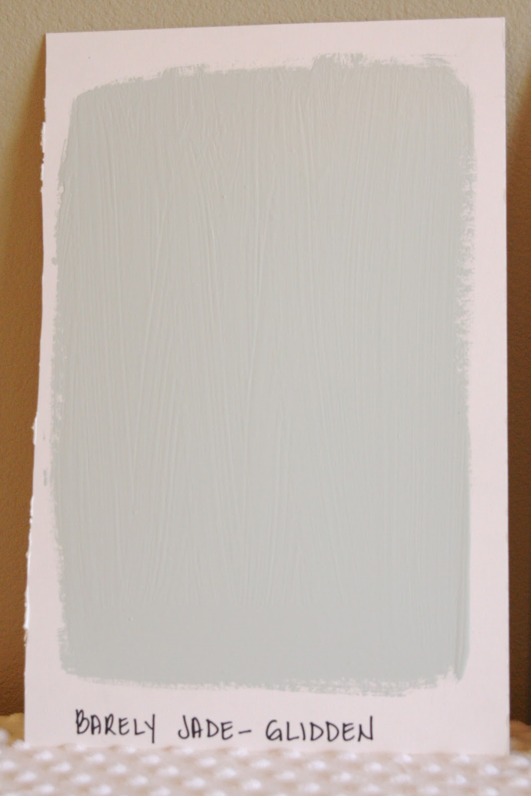
* Barely jade, fossil grey and jade frost
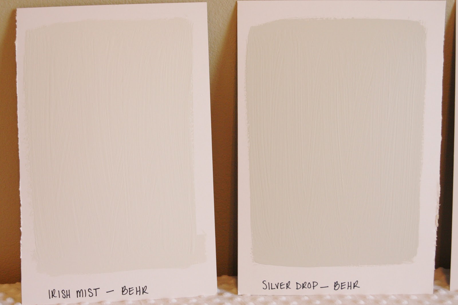
From Behr…
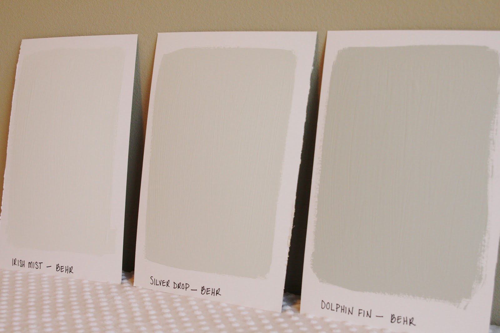
* Irish mist, silver drop and dolphin fin
I was surprised how much I liked these 2…
Just enough color, pretty, not distracting….But will it be enough color?
I also loved this barely jade color for my daughter’s room…
Since we’ll likely add a lot of pink accents to her big girl room, I’m moving away from pink walls. And at some point after move in, I’d love to add an accent wall like I did in her old room. However this time I’m thinking about coral stripes like this…


So, while my paint decisions for the new house aren’t completely decided, at least I’ve got the wheel turning. And I love these larger paint samples. If you’re planning a big painting project, and have a love-hate paint relationship like me, I highly recommend this idea!
I almost went with Revere Pewter (because of Pinterest) when we painted my office last week but I chickened out because it felt a little dark. I love the color though. I just wanted to go lighter in that room! Love all your choices!
-Shelley
hi shelley! thank you for the comment! i'm glad i'm not the only one who thought it was too dark. i looooove the color, but for an office or small space or even a home with low ceilings (ours will have that feature) i was worried it would be too dark.
what color did you end up choosing? if you like any of the lighter colors i shared i think you'd be safe. they are pretty!
xo,
sam
I have always painted sample boards when trying to chose. You are so right, who really knows with a 1 inch square will look like! And, it will look different in different rooms, different lighting. I love to put them up and then see them at different times of the day, and maybe move them from room to room. Good luck. Love the colors you've chosen.
thank you so much!!!!
Just an FYI, Home Depot will mix competitors' colors for you, so you don't have to pay an arm and a let if you like a Benjamin Moore color. 🙂
Irish Mist and Barely Jade are beautiful! Good luck with the decision making…can't wait to see the new house!
P.S. You deserve a large glass of wine after all that sample painting!
I am moving in a month and contemplating colors. I am leaning towards using the same colors again-I hate change and moving 15+ hours away is enough change. I may have to try some sample boards now-I don't want to have regrets and have to get the house painted twice.
I agree. The guy at my local BM told me to do this exact thing. Use poster board for your paint samples. (still havnt made a decision either) Great idea though.
I agree. Thanks for this idea! When we repainted our living room/kitchen last year and I can't paint samples on the walls all over. It got quite confusing. This would have made my life so much easier. Thanks for the idea!!
Paint is so much fun! And I have found the perfect grey (well my mother has…) I think it looks so beautiful and you can check it out here: http://creativepinkbutterfly.com/2013/04/19/living-room-dining-room-home-officehallway-reveal/
For some time now I've been thinking of listing all the paint colors that we've used around the house in one place rather than …
Déjà vu!
I was in search of the perfect light grey for our powder bathroom and went through a lot of the same color options. I even bought a quart of the Revere Pewter but it just looked dark greige on my walls.
Even the initial wall swatch of BM's Moonshine looked beige until I painted the entire room and then it instantly turned into a light grey with blue undertones.
Paint. More capricious than ..well our moods. 😉
http://nubcakes.blogspot.com/2013/02/done.html
I am so happy that you like Silver Drop. I take forever picking paint colors, but I think it is time we'll spent when I love the results.
Good luck!
Haha…that's what my friends and I do, too! SO helpful! I love your color choices!!!
XO, Aimee
I would love for you to share and link up at my weekly TGIF Link Party if you haven't already this week. The party is open every Thursday night and closes Wednesday's at midnight. http://apeekintomyparadise.blogspot.com/. AND starting Wednesday June 4th I will be hosting a Wordless Wednesday link party. Hope you will join us! Plus, save 50% off sponsorships on A Peek Into My Paradise on sale until June 7th; use the code Bobby23Bday.
Have a wonderful week!
Hugs, Cathy
I think this is one of the most vital info for me. And I’m glad reading your article. But should remark on some general things,
The site style is great, the articles is really nice
sampling equipment
Since the paint color dictates the mood in a room, it's smart to consider it heavily What you did is an interesting way to determine which from the variety of colors would make your house feel more homey to you. Go for the lightest hue of blue or gray if you want a tranquil-looking room. Good luck!
Pro Master
Love this post! So glad to know I'm not the only one who does the "giant" swatches on posterboard and puts them around the house to see how they look. I, too, have seen everyone talking about BM's Revere Pewter, but when I look at it under our lighting (our biggest living area has north-facing windows) it has that purplish tint. 🙁 I'm about to embark on painting our whole inside of the house too, and this post has helped me think about possible colors to choose! Thank you!
The reason the B. Moore Tranquility looked different on your walls is because Kate had two drops of blue removed from her bucket in order to make the grey appear more neutral.
We were worried that painting Tranquility as the main color in our open-floor plan ranch style home, it ended up being the best decision ever.
Our guests always compliment how warm and welcoming the house feels.
Hope my Pinterest link works:
http://pinterest.com/pin/285486063853750161/
I love your sample boards. Such a clever, and practical, idea that can help keep a person sane when trying to decide colours. I just slapped sample colour on my walls and I barely recall what some of the colours are.
I also love the Revere Pewter and was going to use it, but then realized that it is basically the same colour I currently have on the walls (which seems too dark for our Californian bungalow). I am contemplating if I am daring enough to just do the whole living room in Swiss Coffee. We shall see.
Thank you and I’m so glad you liked the idea! It definitely helped me with the process as choosing paints is not my strong point…by any stretch!
I love the idea of swiss coffee all over! Would be SOOOO bright!
xo,
Sam
hi, jar saw your site on Pinterest in my desperate search to find the RIGHT gray, which in my head seems to be more like 5000…Id be thrilled if there were on “50” shades of gray to choose from! lol!! But the great thing for me is you seem to have chosen many that I also have, and the most popular colors did not seem right in my South facing home. Im thinking our homes and lighting must be similar. SO I’d love to know what you ended up choosing and do you have pics here? I see this is from 2013, so Im hoping you’re still around. that you in advance if you can give me any direction at all! blessings
*just* forgot to spell check.
:0/
Hi Doralee!
Yes, I’m still blogging here weekly and did share my final paint color choices. It’s a popular post so you can find the link to it on the blog sidebar under “popular posts”.
Thank you so much!
Sam
Love the entry wall color! What is it?
Hi, May I ask where you get the canvas boards you painted on? I’ve been using poster board or something a tad thicker. Maybe you posted it somewhere, But I didn’t see it.
Hi! I purchased them from a craft store, I believe. It was when I was living in another state and this post was from several years ago – at least 6 years. 🙂 So I think they came from Hobby Lobby???
xx,
Sam